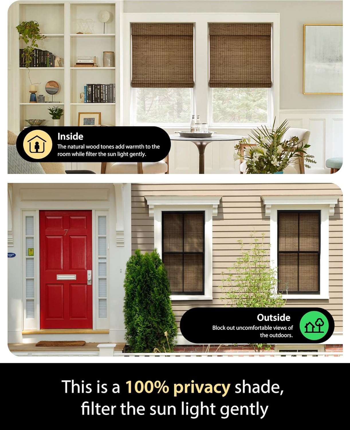
Bamboo shades — the category of window treatments woven from natural grasses, reeds, and bamboo stalks — are one of the quickest ways to bring organic warmth into a room. But if you’ve ever ordered a shade that looked perfect in a swatch photo and then felt oddly cold or clunky next to your actual furniture, you’ve run into the undertone problem. Every bamboo shade has a color personality: some pull honey-gold and amber, others read more gray-beige or olive-taupe. The same shade that looks effortless against a pale oak floor can fight a dark walnut dining table. This guide walks you through how to read those undertones, how to map them against the most common furniture wood families, and how to make a confident pairing decision — even when you’re working from small swatches and a phone photo of your living room.
If you’re a designer, stager, or a homeowner mid-project with samples already on your windowsill, this guide skips the beginner overview and goes straight to the decision framework. By the end, you’ll have a clear “if your furniture is X, reach for Y” rule for each major wood category.
Why Undertones Are the Real Variable (Not the Color Itself)
Most buyers approach bamboo shade selection the same way they’d pick a paint chip: they look at the overall lightness or darkness of the weave. That gets you to the right neighborhood, but it’s undertone — the secondary hue hiding inside the main color — that determines whether a pairing feels intentional or accidental.
Bamboo and woven-wood shades fall into four undertone families:
Golden/amber: The most common. These shades pull warm yellow-orange, the color of raw honey or unfinished pine. Standard matchstick blinds and most entry-level rattan shades live here.
Red/mahogany: Less common but distinct — these shades have a ruddy, brick-adjacent warmth. Some chunky woven textures and darker natural reeds land in this zone.
Gray/silver: Bleached, whitewashed, or driftwood-finished bamboo. These read cooler, leaning toward pale gray or sand rather than gold.
Olive/khaki: A quieter warm-neutral that skews slightly green-gray. Flat-weave grasscloth-adjacent styles often land here, as do some darker sisal-blend shades.
The Spruce’s overview of warm and cool undertones in decor notes that this same warm/cool axis governs whether two naturals feel harmonious or discordant — it’s not about matching the exact color, it’s about locking in the undertone direction. Get the undertone aligned, and a light bamboo shade can coexist with a dark furniture piece without visual noise.
The Four Major Furniture Wood Families — and What to Pair With Them
1. Light Woods: White Oak, Ash, Maple, Birch
These are the dominant furniture and flooring materials in Scandinavian-influenced and transitional interiors as of the mid-2020s. Their shared trait: a pale, relatively neutral base with minimal red. White oak specifically has become the default flooring choice in new construction and renovation projects across much of North America, per Houzz’s ongoing reader trend data on material preferences.
The pairing risk: Golden/amber bamboo shades can make this combination feel muddy or overly “natural” — like a room that’s trying too hard. The warm-on-warm overlay with no contrast can flatten a space.
Best pairing: Gray/silver undertone shades (bleached or whitewashed bamboo, natural seagrass blends that read cool) create clean contrast against white oak without fighting it. Olive/khaki tones also work well here — they add depth without introducing orange.
Avoid: Red/mahogany undertone shades. Placed next to pale ash or birch, the brick warmth in the shade will read as an unintentional color intrusion.
Design note: Apartment Therapy’s guide on mixing wood tones observes that successful wood pairings in contemporary interiors almost always involve one dominant tone and one recessive one. With light furniture, let the shade be the recessive layer. A gray-toned woven shade reads as backdrop; a golden shade competes for attention.
2. Medium Warm Woods: Honey Oak, Pine, Bamboo Furniture, Teak
This is the broadest and most common furniture category in American homes — it includes aging honey-oak cabinetry from 1990s builds, teak outdoor-furniture pieces brought inside, bamboo furniture frames, and mid-toned pine. These woods sit firmly in golden-amber territory.
The pairing risk: Choosing a shade in the same golden register creates a monochromatic saturation that reads as dated — the notorious “all-oak everything” look of the 1990s. Architectural Digest’s piece on mixing wood tones specifically calls out same-family repetition as the most common mistake in natural-material rooms.
Best pairing: There are two viable strategies here, and they pull in opposite directions:
- Contrast upward: A gray/silver bleached shade lifts the room and creates visual air. The cool-neutral of the shade balances the orange-warm of the furniture.
- Layer texture, not color: If you want to stay warm, choose a bamboo shade with a noticeably different weave scale or texture than the furniture’s grain. A chunky roman-shade weave against a fine-grain teak table reads as intentional layering; a matchstick shade against honey oak just doubles the same note.
Avoid: Red/mahogany undertone shades, which amplify the ruddy quality of honey oak and push the room into a heaviness that’s hard to correct without repainting.
3. Dark Woods: Walnut, Espresso-Stained Oak, Dark Mahogany, Wenge
Dark furniture is the most forgiving category for bamboo shade pairing — the contrast between any natural-toned shade and a very dark wood frame is inherently strong enough to do the work. But the quality of the pairing still depends on undertone matching.
By the numbers:
- Walnut’s natural undertone: gray-violet to warm brown (grain-dependent)
- Wenge: near-black with cool gray striping
- Espresso-stained oak: typically pulls red-brown
- Dark mahogany: strongly red-warm
| Furniture | Shade undertone to match | Shade undertone to avoid |
|---|---|---|
| Walnut | Golden/amber or olive/khaki | Gray/silver (too cool — looks bleached) |
| Wenge | Gray/silver | Red/mahogany (clashes) |
| Espresso oak | Olive/khaki | Golden/amber (too light, competes) |
| Dark mahogany | Red/mahogany or golden/amber | Gray/silver |
Best pairing for walnut (the most common premium furniture wood): A golden-amber woven shade echoes walnut’s own warm base note and creates continuity. Elle Decor’s feature on layering natural textures in a room specifically names the walnut + warm-woven-shade combination as a “ground rule” for organic modernism — the shade picks up the amber in the wood grain rather than fighting it.
Avoid with walnut: Bleached or whitewashed shades, which create a cool-vs-warm tension that can read as a mismatch rather than intentional contrast.
4. Mixed or Multi-Finish Rooms (The Real-World Default)
Most rooms that reach a designer’s or experienced homeowner’s desk in 2026 aren’t single-wood. They’re a walnut dining table with white oak floors, a mahogany bookcase alongside mid-century teak chairs, or painted cabinetry with bamboo furniture accents. This is where the “undertone alignment” framework earns its keep.
The rule for mixed rooms: Identify the dominant wood in the room — the piece with the most visual mass, typically the flooring or the largest furniture item. Pair the shade undertone to that piece, not to the secondary pieces.
Secondary strategy: If the two dominant woods are genuinely at odds (say, white oak floor + dark mahogany dining table), use a neutral-bridge shade — an olive/khaki or mid-tone natural that doesn’t strongly favor either end. This is the same logic that Architectural Digest’s mixing-wood-tones guide describes as “a unifying thread”: a material that doesn’t take sides in the existing conversation.
How to Evaluate Swatches in Your Actual Room
Shade swatches viewed under a retailer’s or designer’s lighting lie. This is not an exaggeration — the standard warm-white LED used in most showrooms reads every bamboo swatch as slightly more golden than it will appear under your home’s particular light mix.
Three practices that reduce risk:
1. Light test in both morning and evening. Natural morning light (blue-shifted) will reveal gray or olive undertones you can’t see under artificial light. Evening lamp light will amplify golden and red undertones. A swatch that looks neutral at noon may look distinctly amber by 7 p.m.
2. Place the swatch against the largest furniture surface, not the floor. Most homeowners test swatches on the floor because it’s easy. But the shade’s visual relationship to your sofa, cabinetry, or dining table — at eye level — is the operative pairing. Put the swatch where the shade will actually be read from.
3. Request a full-width sample when the order is large. Retailers at the Smith & Noble and The Shade Store tier routinely provide larger samples for custom orders. The weave pattern and its undertone can shift significantly from a 3-inch chip to a 12-inch panel because the shadow behavior of the weave changes at scale.
Houzz’s buying guide on woven wood shades notes that undertone discrepancy between swatches and installed product is one of the most frequently cited sources of buyer dissatisfaction in the woven-shade category — and that lighting conditions during evaluation are the primary variable.
The Decision Rule
If you’ve read this far and you’re holding swatches right now, here’s the condensed framework:
- White oak / ash / pale maple furniture → reach for gray/silver or olive/khaki bamboo shades. Avoid golden-amber and red undertones.
- Honey oak / pine / teak furniture → contrast with gray/silver, or go textural within the warm family. Avoid same-tone golden repetition; avoid red/mahogany.
- Walnut / dark warm woods → match with golden/amber or olive/khaki. Avoid bleached or cool-gray shades.
- Wenge / cool-dark woods → gray/silver or olive/khaki. Avoid red/mahogany.
- Mixed-wood rooms → identify the highest-visual-mass piece and pair to it. When in true conflict, use an olive/khaki neutral-bridge shade.
The underlying logic is the same in every case: you’re not trying to match the wood exactly, and you’re not trying to create maximum contrast for its own sake. You’re aligning undertone direction so that the shade reads as a deliberate layer in the room rather than an afterthought. Get the undertone right, and the texture and light-diffusion qualities of the shade — which are what make woven naturals worth specifying in the first place — can do their job without visual interference.